
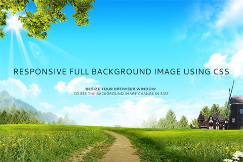
Een website met een volledige achtergrond is tegenwoordig erg populair. Met de introductie van CSS3 is dit zeer eenvoudig te bewerkstelligen, en daarbij hebben we geen javascript nodig!
We maken hiervoor gebruik van background-size property, de waarde cover zorgt ervoor dat de achterground volledig en proportioneel (dus zonder uitrekken) wordt geschaald. De hoogte en de breedte van de achterground zijn dus altijd gelijk aan of groter dan de viewpoint.
Voor mobile gebruikers, is het aan te raden om een kleinere versie van de achtergrond te gebruiken. Dit kan de laadtijd van de pagina enorm versnellen.
<!doctype html>
<html>
<body>
  ...Your content goes here...
</body>
</html>
body {
  /* Location of the image */
  background-image: url(images/background-image.jpg);

  /* Background image is centered vertically and horizontally at all times */
  background-position: center center;

  /* Background image doesn't tile */
  background-repeat: no-repeat;

  /* Background image is fixed in the viewport so that it doesn't move when
     the content's height is greater than the image's height */
  background-attachment: fixed;

  /* This is what makes the background image rescale based
     on the container's size */
  background-size: cover;

  /* Set a background color that will be displayed
     while the background image is loading */
  background-color: #464646;
}
Het gaat hier uiteraard om de onderstaande regel
body {
    background-size: cover;
}
En dit alles kan ook in 1 verkorte regel
body {
  background: url(background-image.jpg) center center cover no-repeat fixed;
}
@media only screen and (max-width: 767px) {
  body {
    /* The file size of this background image is 93% smaller
       to improve page load speed on mobile internet connections */
    background-image: url(images/background-image-small.jpg);
  }
}